Client
No Place Like Home — a Memphis-based furniture retailer reimagined for a new generation of homeowners and renters.
Service
Brand Strategy, Visual Identity, Environmental Design, Packaging, Print Collateral, Web Design, Social Campaigns


Challenge
No Place Like Home was ready to move beyond its outdated identity and inconsistent messaging. Despite having loyal customers, the brand lacked a cohesive look and emotional voice that reflected what it truly offered — warmth, comfort, and community.
The challenge was to design a system that felt trustworthy enough for families yet stylish and modern enough to compete with national furniture retailers.
What We Did
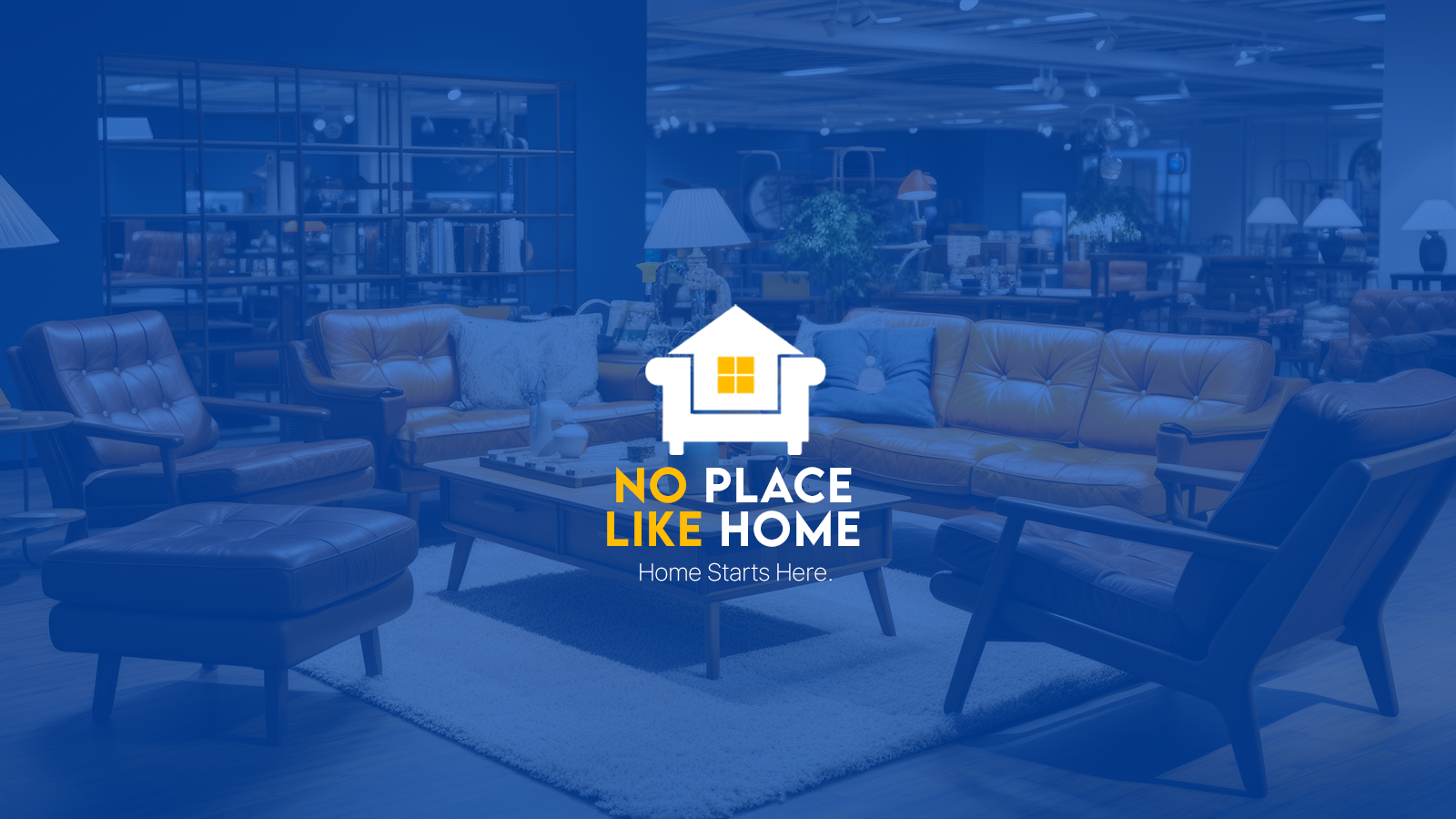
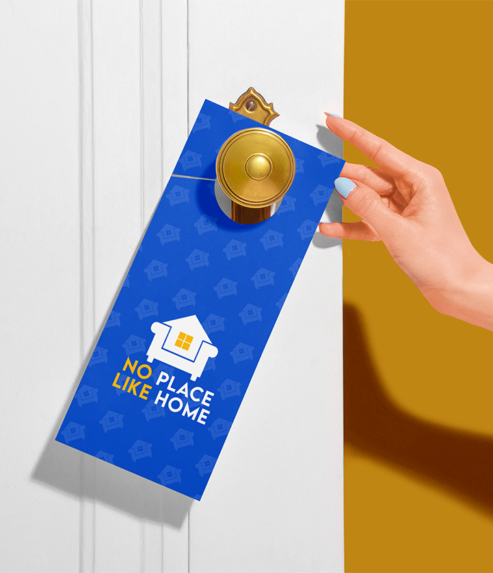
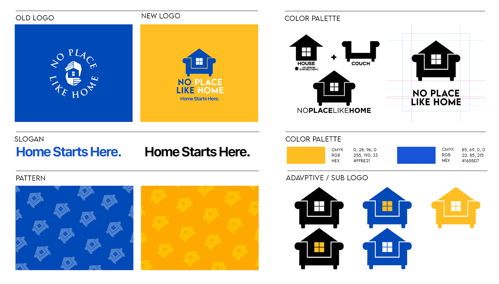
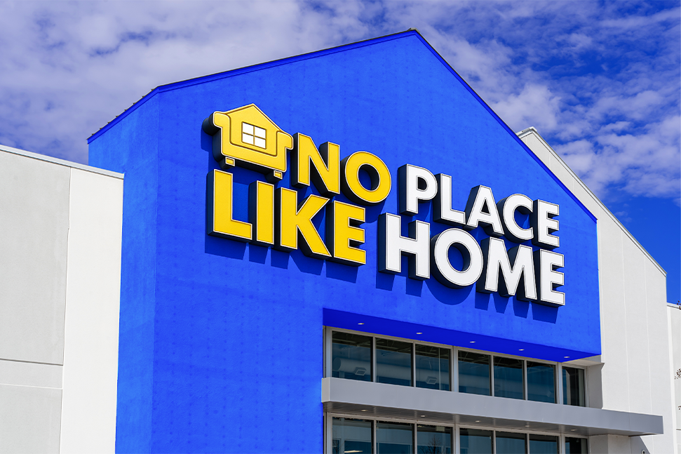
We redefined the brand from the ground up. The new logo merges a house and a couch — a visual metaphor for comfort meeting lifestyle. From packaging to signage, every design choice centered around the feeling of home.
We introduced the tagline “Home Starts Here” to ground the brand’s message in warmth and belonging. The color palette of royal blue and sunlit yellow balanced reliability with optimism, while clean typography and modern layouts created a unified presence across every touchpoint — in-store, online, and in print.
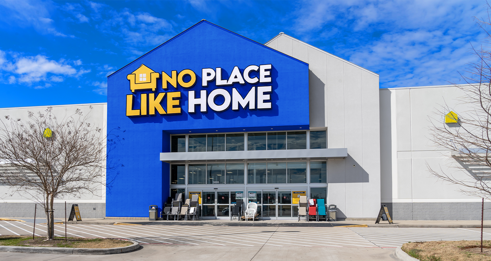

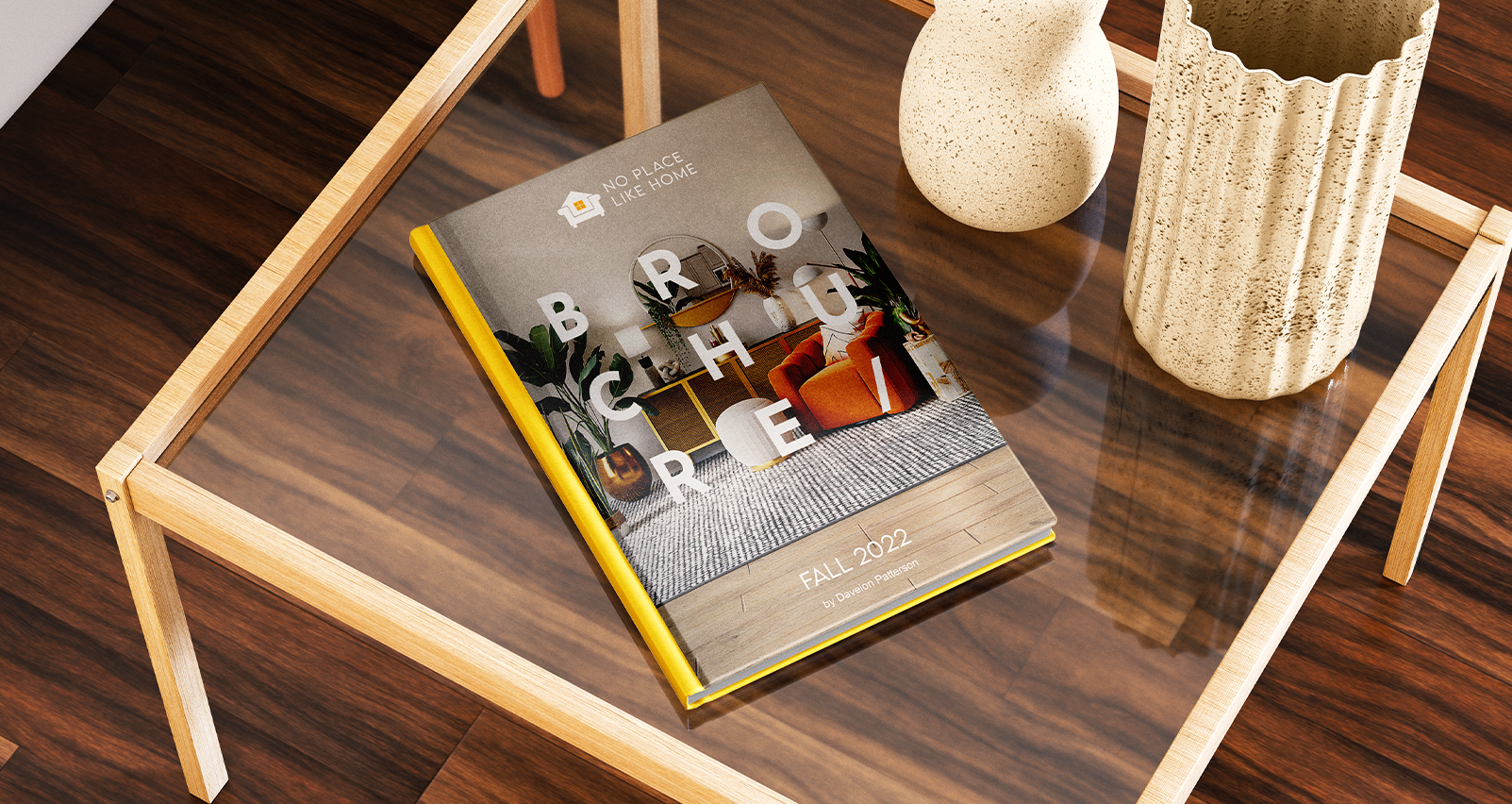
The launch campaign brought the rebrand to life:
• A Grand Opening event with financing offers and giveaways.
• Uniforms, delivery packaging, and storefront signage that turned the store into a cohesive visual experience.
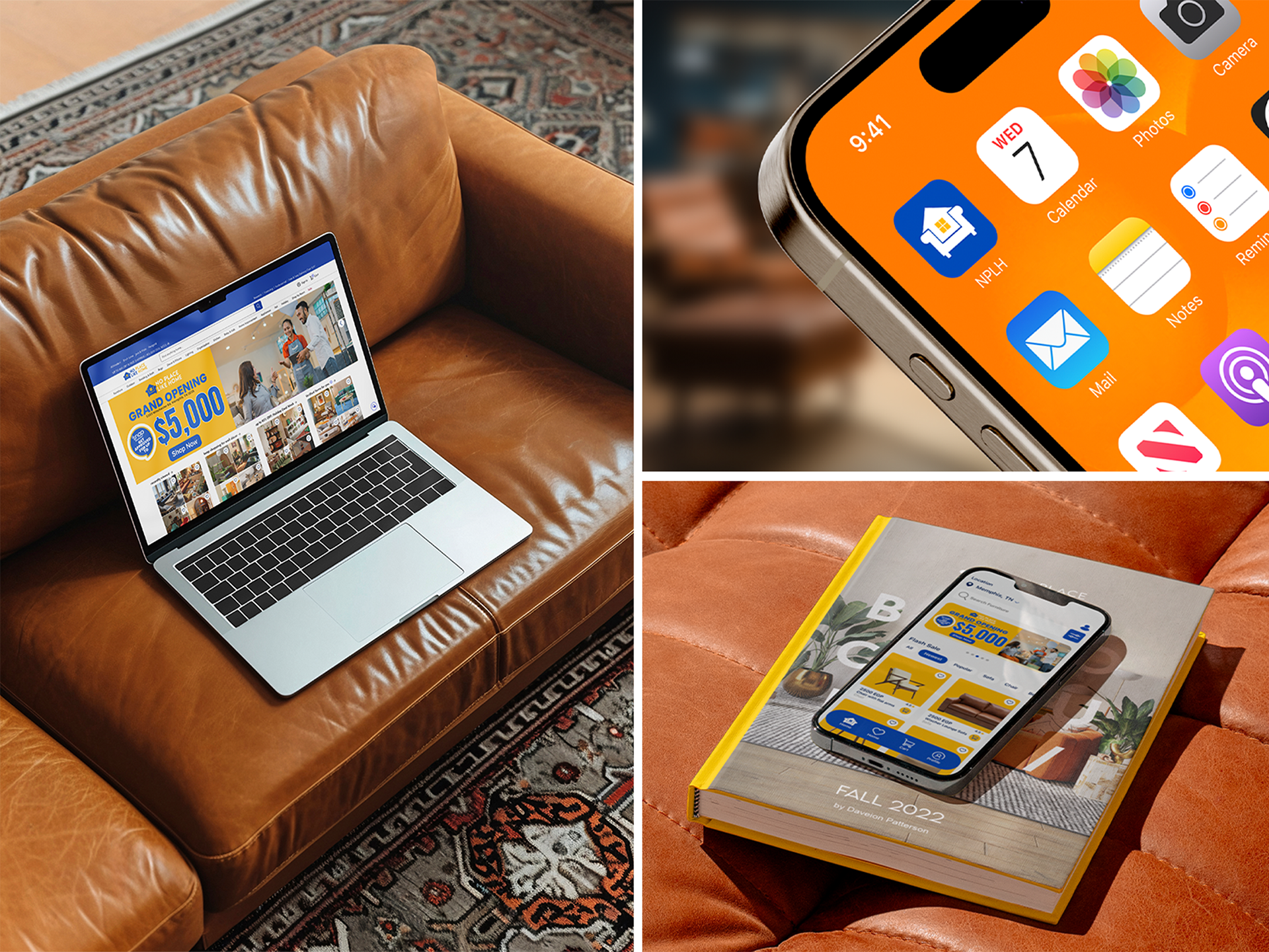
• Digital touchpoints — website, mobile app icon, and social media rollout — that extended the brand’s energy into every customer’s screen.
• A Thank You card system to connect emotionally with customers post-purchase.

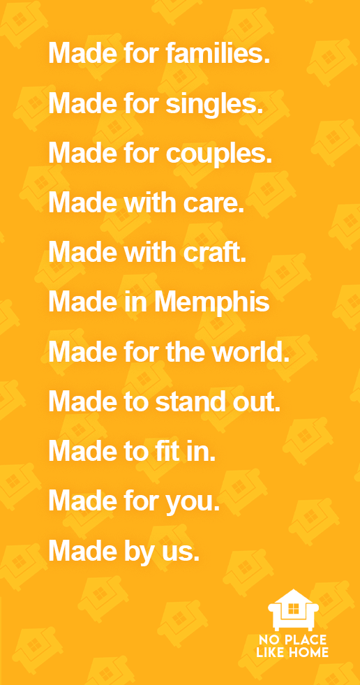


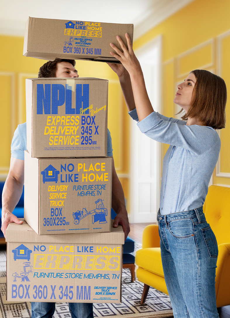

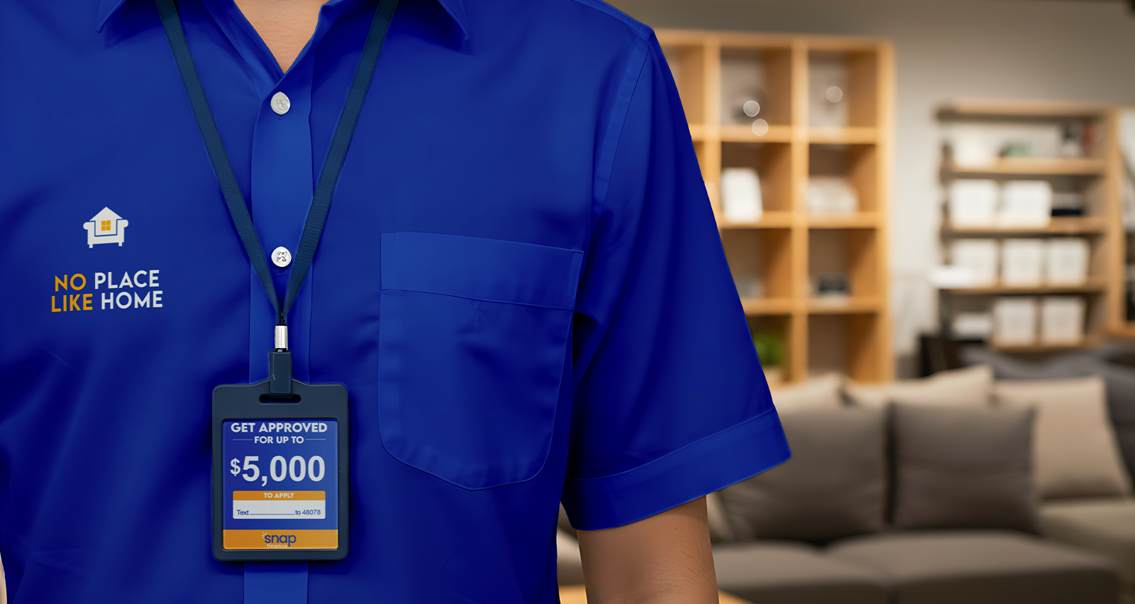
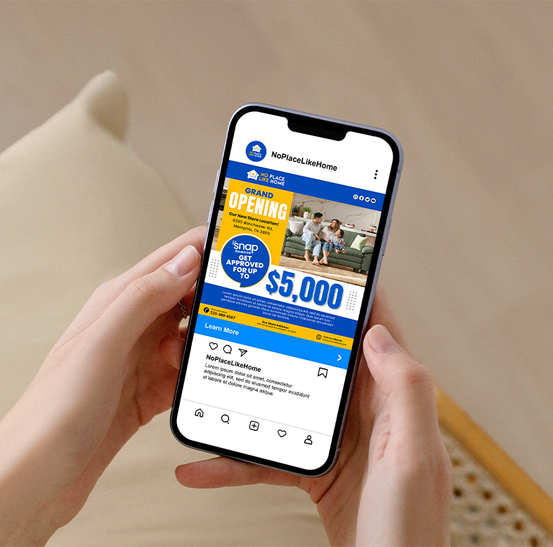
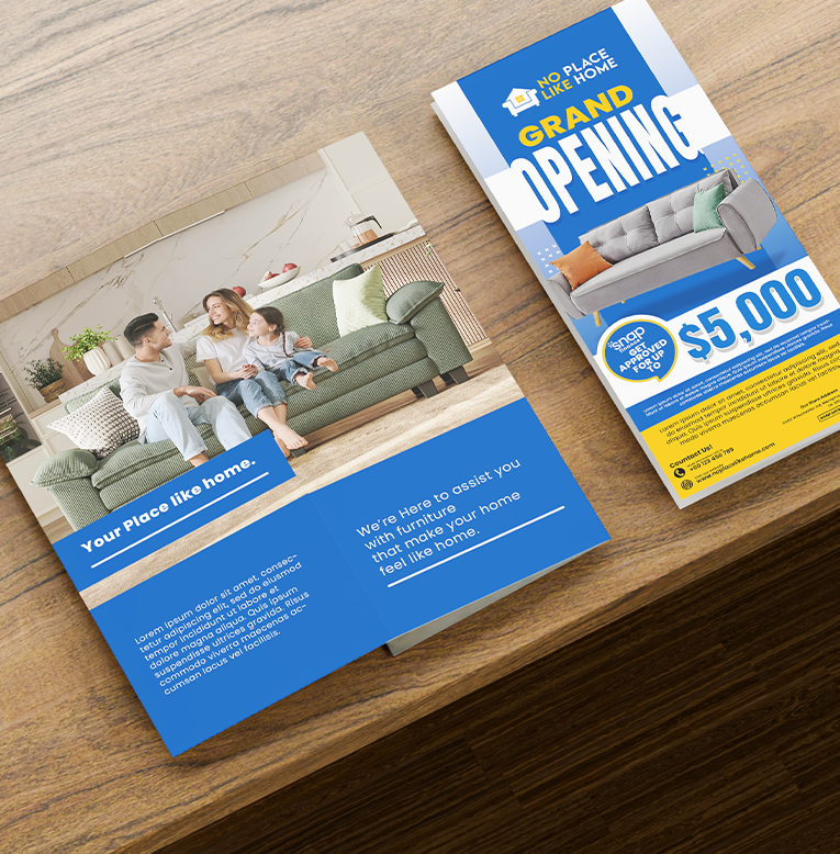
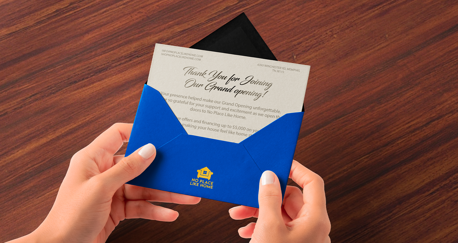
Every piece told the same story: when you step into No Place Like Home, you’re not just shopping for furniture — you’re building the life you want to come home to.